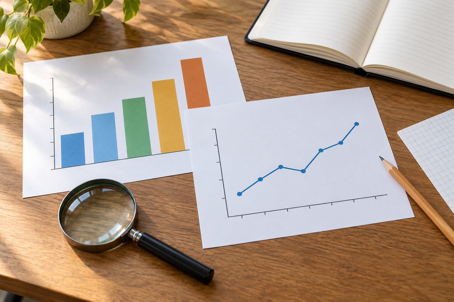
A misleading chart shows real numbers in a way that creates a false impression, usually through a truncated axis, a cherry-picked time window, missing labels or decoration that flatters one series. Knowing how to spot a misleading chart takes less than a minute once you know the eight things to look at, and none of it needs data-analysis training.
Most readers never do this check, which is exactly why the tricks keep working. You only need the graphic itself, a calculator or spreadsheet, and about sixty seconds.
Table of Contents
- What You Need Before You Start
- Step-by-Step: How to Spot a Misleading Chart
- 1. Check the title, labels and the claim being made
- 2. Examine the axes and the scale
- 3. Look for a distorted or missing baseline
- 4. Compare the numbers behind the picture
- 5. Investigate the source and the method
- 6. Test whether the comparison is fair
- 7. Look for missing context and unstated uncertainty
- 8. Inspect the visual design and the annotations
- The Deeper Audit: Tracing a Chart Back to Its Source
- Red Flags, Effects and Fixes
- Common Mistakes When Reading Charts
- Frequently Asked Questions
- Can a chart with a truncated y-axis be misleading?
- How can I tell if a chart is cherry-picking data?
- What is the fastest way to check whether a chart is accurate?
- Does a zero baseline always make a chart honest?
- How do I verify the source of a viral chart?
- Why should I care about confidence intervals and error bars?
- Conclusion
What You Need Before You Start
You need very little, and you almost certainly already have it.
- The chart in full. If it is cropped in a social post, look for the original. Half the deception disappears once you see the whole graphic.
- The axis numbers and units. Read them, don’t assume them.
- A stated date range. Every time-series chart should tell you which years it covers.
- A cited source. Ideally the name of the data producer plus a link, report title or table number.
- One reference point. The prior year, a target, a five-year average. Without a baseline of some kind you cannot judge whether a change is big.
- A calculator or a spreadsheet. Thirty seconds of arithmetic settles most disputes.
If a chart is missing the source, the units and the date range, that absence is itself a finding. Charts that hide their provenance tend to be the ones with something to hide.
Step-by-Step: How to Spot a Misleading Chart
Run these eight checks in order. Work from the labels and the source outward, because a chart with a clean axis and no citation can still lie, and the closer you look to the numbers the less room a designer has left to hide.
1. Check the title, labels and the claim being made
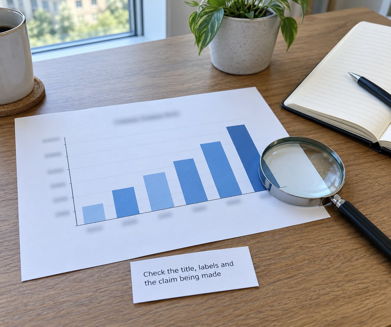
Read the title as a claim, not a caption. Does it say what the chart shows, or does it assert a conclusion the chart cannot support?
Watch for four things: missing units, vague categories, loaded wording and a headline that outruns the data. A bar labelled “sales” with no currency, no region and no period tells you almost nothing. Categories like “households served” that quietly mix students with graduates are the same problem in words.
Then compare the language to the scale. Words like “soar”, “rocket” and “surge” usually sit next to changes of a few percent. Graphics shared widely in the 2026 news cycle have run tax or crime figures on an axis that started far from zero, which turned a small move into what looked like a cliff.
2. Examine the axes and the scale
Find the lowest number printed on the vertical axis. If it is not zero on a bar chart, ask why before you accept the picture.
Then check the interval between tick marks. 0, 10, 20, 30 is a steady scale. 0, 5, 30, 60, 100 is not, and unequal intervals make a steady rise look like an accelerating one. A broken axis drawn as a zigzag or a pair of slashes is a deliberate flag: someone wants you to skip the gap.
Two more scale tricks to know. A logarithmic scale compresses large numbers and expands small ones, which is legitimate for values that span orders of magnitude and misleading for a range where it hides the size of a gap. And a reversed axis, where values climb downward, inverts the emotional meaning of a result: a rise can be drawn as a fall.
3. Look for a distorted or missing baseline
A bar encodes its value by length, so its baseline is part of the measurement. Truncate that baseline and you have changed the ratio between the bars.
Here is the arithmetic worth memorising. Take a value of 200 plotted against 210. Honest bars on a zero baseline differ by 5 percent, and the taller one looks barely taller. Start the axis at 195 instead and the same pair of bars fills the whole chart height, so the gap looks enormous. Nothing about the data changed. Every visual cue just changed.
The rule is narrower than most people think. Bars and area charts, where length and area carry the value, normally start at zero. Line charts, dot plots and market price series can legitimately use a non-zero axis because the reader is comparing positions and slopes rather than lengths. A missing label on the axis is what turns that legitimate zoom into a deceptive one.
4. Compare the numbers behind the picture
Get yourself the actual values. Many charts label the endpoints directly, and if they do not, the axis gives you enough to estimate within a few percent.
Once you have numbers, do three things. Calculate the absolute difference, then the percentage change. Check the denominator, because a rise from 12 to 15 is 25 percent of a small base and a rounding error next to a rise from 12,000 to 15,000. And compare against something other than the previous point, since the previous point may be the lowest in the series.
Slices need a different check. Pie slices must add to 100 percent, and if they visibly exceed or fall short of the circle, the chart is broken. Areas in an infographic are worse than pies because people compare area poorly: an icon scaled up 10 percent in both width and height grows 21 percent in visible area.
5. Investigate the source and the method
Find out who produced the underlying data before you find out who drew the graphic. A news organisation reporting a government statistic is a second-hand source, and the first-hand document is where the definitions live.
Four questions get you most of the way. What was measured, and how? How many observations were there, and over what period? Who was included and who was excluded? Were the figures measured or modelled, and were the margins of error published?
Search phrasing matters too. A survey of “people who use this service” does not describe the general population, and a headline that drops those qualifiers has borrowed authority it was never given.
There is a practical limit here worth stating plainly. Re-drawing a chart honestly needs tooling most readers do not have, so you will sometimes end at “the numbers are not available.” That is a legitimate conclusion. Say it instead of pretending you verified something.
6. Test whether the comparison is fair
Look at the window. A line chart that starts at the trough before a rise and ends at the peak after it can turn a bumpy two-year stretch into a straight climb. Extend the window and the drama usually deflates, which is why cherry-picked data charts tend to have suspiciously tidy endpoints.
Then check that the compared things are actually comparable. Different definitions, different measurement methods, different categories, different time spans, or groups of wildly different sizes are all ways to stage a contest nobody agreed to.
Statistically subtle versions of the same move cause just as much damage. Survivorship bias counts only the cases that made it through. A missing base rate shows a high percentage of a small group without the small number itself. Simpson’s paradox is when the trend reverses when you split a combined group into its parts, which happens with hiring rates, test scores and almost any aggregated outcome.
7. Look for missing context and unstated uncertainty
An average is not the whole distribution. A single average hides the spread, and a large spread means two cases described by the same number may be far apart.
Watch the units of the estimate itself. Small samples produce uncertain results, and the uncertainty has to be shown: a confidence interval, an error bar, a margin of error, or at minimum a sample size somewhere on the graphic. An estimate drawn as a single flat line with three decimal places and no sample size is a claim dressed up as a measurement.
Check the denominator once more for rates. Counts and rates are not interchangeable. Two districts with similar counts can have wildly different rates if their populations differ, and quoting the count alone is the single most common way a true number creates a false impression.
8. Inspect the visual design and the annotations
Design is where intent usually shows up. Flat two-dimensional rendering beats 3D, because perspective distorts apparent area and the distortion is almost always in the direction of the thing being promoted. Unequal column widths, oversized icons and pictograms with more than one dimension scaled all exaggerate by the same mechanism: you compare area, and area lies.
Check colour too. If red and green carry the entire meaning, roughly one in twelve men with colour vision deficiency cannot read the chart at all, which is why WCAG 2.1 asks that colour never be the only means of conveying information and that non-text contrast meet defined ratios. A polished palette on a bad chart is decoration, and Edward Tufte’s data-ink ratio is the useful test: how much of this ink is carrying data rather than framing it?
Finally, read the annotation and the axis titles as claims. A dual-axis chart with two different scales lets you imply any correlation you like by stretching one side, and a footnote that says “indexed to 200 = 100” is a rebasing trick that makes unrelated series look comparable. Selective highlighting, arrows, zoom insets and a source line in 6pt type all belong here.
The Deeper Audit: Tracing a Chart Back to Its Source
When the eight checks leave you unsure, walk the chain rather than guess.
- Reverse-look-up the dataset. Search the headline statistic with the source name attached. If the number only exists in the graphic, it may not exist anywhere else.
- Read the original footnote. Definitions, exclusions and revisions live in footnotes and appendix tables, not in headlines.
- Find the earlier release of the same series. If the current version starts at an unusually flattering point, the original start date tells you why.
- Check who funded the analysis. A study funded by an interested party is still a source, just a weighted one.
- Compare against an independent series on the same measure over the same period. Two unrelated datasets telling different stories is a strong reason to slow down, not to pick the one you prefer.
Two caveats on why these charts keep circulating, even when the numbers are fine. The picture superiority effect means people remember and repeat the image and forget the caveat printed under it. Confirmation bias then does the rest: readers accept the chart that agrees with what they already believed. There is also a less dramatic explanation than bad actors, namely that software defaults and deadlines produce most bad charts. Excel and Sheets auto-scale axes and offer 3D effects that most people never look at.
One newer wrinkle: charts produced by generative AI. Exploratory work published in 2026 reported models describing their own output as honest whether or not it was. A generated chart therefore needs the same audit as a published one, maybe more, because nobody chose the axis on purpose.
Red Flags, Effects and Fixes
- Bar axis starts above zero. Makes a small difference look enormous. Fix: start the axis at zero, or use a dot plot and label the range.
- Unequal tick intervals. Turns a steady rise into an accelerating one. Fix: even intervals, or mark the break visibly.
- Log scale on a narrow range. Hides the actual size of the gap. Fix: a linear scale, with the log choice explained in a note.
- Reversed axis. Inverts rise and fall. Fix: standard direction unless the convention is stated.
- 3D bars or 3D pie. Distorts apparent area and depth. Fix: flat 2D rendering.
- Pictograms scaled in two dimensions. A 10 percent scale-up reads as 21 percent growth. Fix: scale one dimension only.
- Time window starting at a trough. Amplifies any recovery. Fix: show the full series, or several comparable windows.
- Percentage with no base. 25 percent of 12 reads like 25 percent of 12,000. Fix: give the raw counts next to the percentage.
- Dual axis, two scales. Invents a relationship between unrelated series. Fix: two charts, or index both series to a common base year.
- Colour carries the meaning alone. Excludes readers with colour vision deficiency. Fix: add labels, patterns or shape as a second channel.
- No source, no date range. Makes the numbers unfalsifiable. Fix: cite the producer and the period on the graphic.
- Precision beyond the sample. Presents an estimate as a measurement. Fix: round honestly, publish the sample size and error bars.
Common Mistakes When Reading Charts
Assuming every non-zero axis is a lie. Line charts, dot plots and market price series can start anywhere, because position and slope carry the meaning rather than length. The error is an unlabelled axis, not the zoom itself.
Reading a percentage without the base. “A 40 percent increase” is meaningless until you know whether it moved 4 items or 4,000. Always ask for the raw count.
Treating a correlation as a cause. Two lines that rise together prove neither line pushed the other. Spurious correlation is common because any two wandering series can be made to line up over a short window, and dual-axis charts make this easy on purpose.
Trusting a screenshot. Cropped graphics drop the source line, the units and the context that made the chart defensible. Find the original before you forward it.
Treating polish as proof. Good typography says nothing about the axis range. A designer can make a dishonest chart look more authoritative than an honest one, which is why design quality is the last thing you assess, not the first.
Dismissing the whole source over one bad chart. Being wrong once is not evidence of bad faith everywhere. Naming the specific defect is more useful than a general verdict, and it is the kind of challenge that gets a correction posted.
Stopping at the visual impression. The first glance tells you nothing reliable. Take thirty seconds with the numbers and the source; that is the whole difference between a reader and an audience.
Frequently Asked Questions
Can a chart with a truncated y-axis be misleading?
Yes, and it is the most common trick. Truncating the axis rescales the bars so a small difference fills the chart. A rise from 200 to 210 looks like a 5 percent change on a zero baseline and a dramatic leap when the axis starts at 195. It is legitimate only where position and slope carry the value, such as line charts and dot plots, and even then the range must be labelled.
How can I tell if a chart is cherry-picking data?
Look at the endpoints. A series that begins at an unusually low point and ends at an unusually high one is a strong signal. Check how many years are plotted, whether the window is shorter than the reporting period, and whether the comparison group includes the bad years too. If extending the window to the same span in both directions deflates the story, the window was chosen for the conclusion.
What is the fastest way to check whether a chart is accurate?
Find the y-axis baseline first. It takes three seconds and catches the most common deception. Then spend another thirty on the source line and the date range, because a chart with no provenance cannot be verified at all. If both check out, do the arithmetic on the endpoint values and compare against a reference period such as a five-year average.
Does a zero baseline always make a chart honest?
No. A zero baseline only protects one visual channel: length. A chart can start at zero and still mislead through a cherry-picked time window, a percentage with no base, a dual axis or a 3D effect. The zero baseline is the first check, not the whole audit, and treating it as a guarantee is its own kind of mistake.
How do I verify the source of a viral chart?
Search the headline statistic in quotes together with the claimed source name. If the figure appears only inside the graphic, treat it as unverified. When you find it, go past the news write-up to the original dataset or report and read the definition, sample size and date range in the footnote or appendix, since that is where the qualifications usually sit.
Why should I care about confidence intervals and error bars?
Because a number without an uncertainty range is a claim, not a measurement. A survey of 40 people can produce a percentage that swings widely with a single response. Error bars, confidence intervals and published sample sizes tell you how much the result could move, and they are the difference between a finding you can act on and one that is noise dressed as a fact.
Conclusion
If you remember one thing from this guide on how to spot a misleading chart, make it the order of operations. Name the claim the graphic is making, find the source and check the date range, read the axis and its baseline, then do the arithmetic on the actual values and decide whether the comparison is fair before you share it or act on it.
Sixty seconds, in that order, will catch nearly everything worth catching.